I follow AlexOnRaw and admire his work and his the work he has put into teaching people how to use the raw converter, Capture One. He also has some great Capture One styles and presets that I can recommend. I moved to Capture One from Lightroom more than a year ago, and haven’t looked back. I have become pretty proficient in using Capture One and really appreciate the speed, stable tethering and excellent color editing possibilities.
Anyhow, Alex had posted his monthly challenge on his blog: Editing an image using only Capture One.
The first prize was some very cool and useful presets from The Image Alchemist and Phase One sponsored a very nice jacket! That’s me on the right in my new Phase One jacket! ;)
Voting is usually open for anyone. But for the February Challenge there was a panel of three very competent photographers, all of whom are guest photographers for Phase One’s, Capture One blog:
Paul Steunebrink
Cameron Davidson
Alexander Svet
I like a good challenge, so I downloaded the raw image and had a go at it!

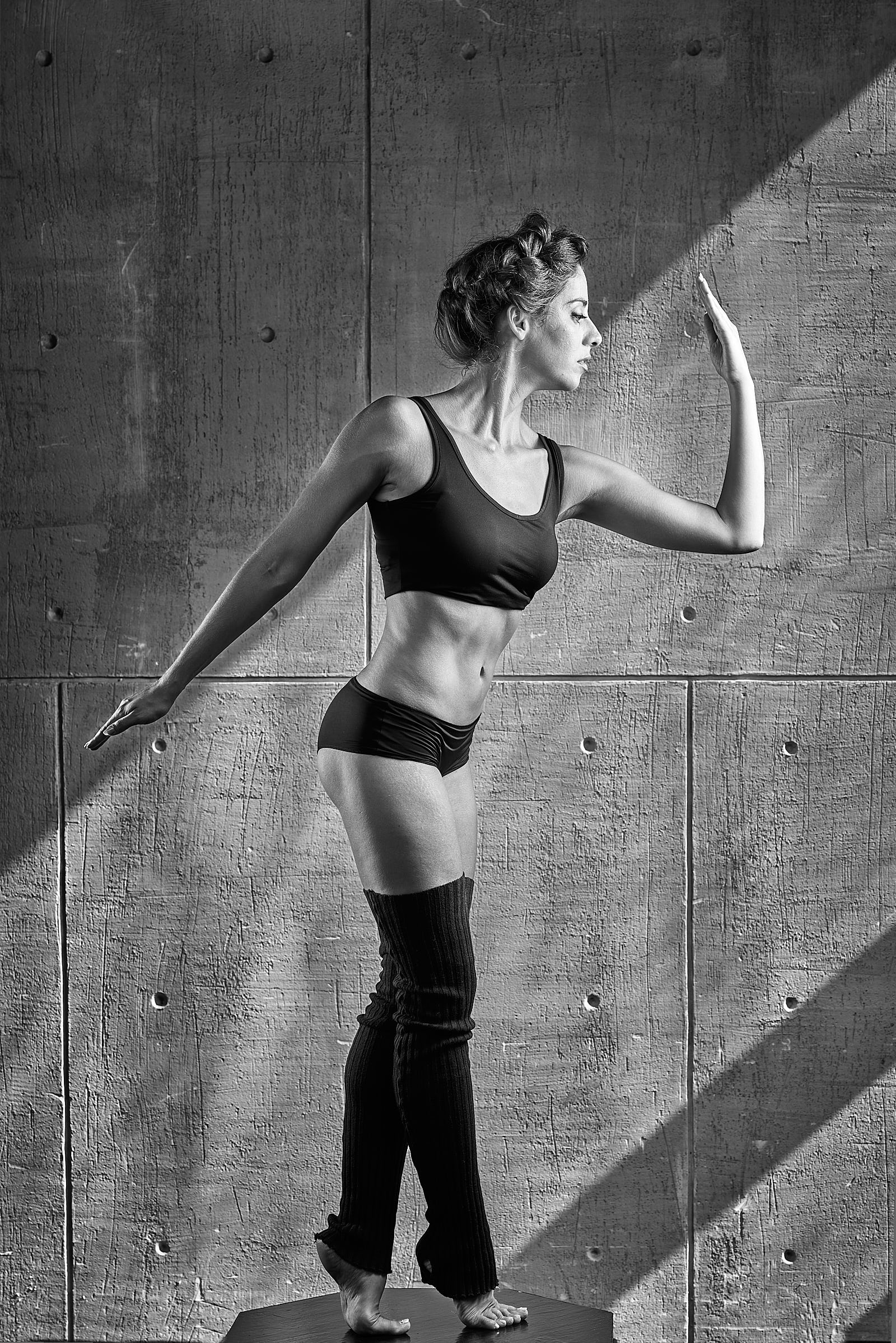
Unedited image. (click to enlarge)
The raw image…
The unedited, raw image for the challenge was supplied by Alex Svet and can be seen here to the left. This is not my image. If you would like to follow along in Capture One, you can download the EIP file that I (and the other winners) supplied. The EIP files contain the Capture One edits including the layers.
You can also access just a copy of just the raw image here if you would like to try your own editing.
The first thing I did was to simply look at the image. What stood out to me first? (aside from the fact that the model has a killer body!). I noticed the lines and angles, the rough texture of the wall against the smooth texture of the model’s skin as well as the contrast of light. These are very dominant. So I decided that I wanted the textures, contrast and lines to be emphasised. The best way to do that would be to create a black’n’white image.
I also noted that the image is leaning slightly to the left.
Before I start the actual editing process, I usually play around with adjustments and sliders, seeing which colors there are, seeing if any of the details are lost in the highlights or shadows.
That gives me an idea of what I need to keep in mind and what I have to work with. There was detail in the shadows and only a tiny bit of detail lost in the highligt on the model’s left hand (the one that is raised).
Now, editing isn’t a linear process. By that I mean that I don’t go step-by-step and adjust exposure, then contrast, then color, etc. I go back and forth to adjustments. More often than not, making one adjustment means going back and correcting previous adjustments. Or maybe I change my mind. Or I get new ideas. Therefore, this will be an overview of the final adjustments that I made on the image…not the winding road that I followed to get to them. It is also worth noting that I only used a fraction of Capture One’s “super powers”.
Before I start a b/w image, I usually start by editing the image in color. Because I want to bring out textures, I edited the image to be extra contrasty. I know that I will be readjusting them, but this is just a starting point.
In this instance, pretty much everything ended up not being changed that much. Most of the contrast was actually achieved in the b/w conversion.
Black & White conversion
In the Black & White menu, you can see that I have pushed and pulled all of the sliders to see which colors effect the image the most.
It turns out there were only Reds and Yellows in the image.
I thought there might have been some Blues or Cyans from what appears to be window lights. You can often get blue’ish colors from windows due to the sky outside.
I adjusted the Reds and Yellows to increase the contrast and help bring out textures. I over did it slightly, as I knew that I would be editing the models skin separately on an adjustment layer
That is basically all I did for the ‘base’ adjustments. Then I added layers to adjust individual parts of the image. Keep in mind, that as I use adjustment layers, I will also often go back to the Background layer and other layers and tweak things. I will therefor simply explain the reason for the layers starting from the bottom layer.
This shows the graduated mask that I added to darken the shadow.
Layer: “dark clothes”
When I added contrast, I lost detail in the model’s clothes and hair. But I knew the detail was there and that I could bring them back separately on a layer. I adjusted Exposure, Shadow recovery and Curves and brushed the adjustment on her clothes and some of her hair.
Layer: “skin highlights”
This is very subtle. A slight curves adjustment has been brushed on to some of the skin highlights on the model to enhance and smooth them out. I used “Luma Range” to keep the adjustment within the highlights.
Layer: “grad left”
I wanted to darken the shadows in the upper left-hand corner to resemble the dark shadow at the bottom right. I pulled a gradient down the corner and erased the grad from the models head and arm.
This shows the mask (in pink) around the model in order to keep my edits to the wall off of the model
Layer: “texture”
The wall needed more texture (can’t have too much texture!), so I punched up the clarity. But I didn’t want more texture on the model’s skin. I meticulously masked out the model and the podium. Refine mask was a great help, but I did need to zoom in and use a very small brush in some places. Luma Range is no help here, because the tones of the wall and skin are very similar.
Layer: “Repair Layer 1”
I softened the hole between her face and hand using the Healing tool. For consistency, I didn’t want to remove it totally, but to simply tone it down a bit using the Opacity slider.
Layer: “Repair Layer 2”
When I was as finished as I felt I could be with the image, I corrected the crooked lines. I used Keystone and Rotation. Because I was almost loosing her feet, I ticked the “Crop Outside Image” box in Crop. This meant that there would be some transparent areas near the bottom of the image. Using the Clone tool, I ‘added pixels’ to the transparent areas, trying to be careful not to create too much ‘pattern repetition’ (looking at the image now, I see that I wasn’t totally successful - sigh).
Finally, I added a light vignette.
So that was an explanation of how I ended up with ‘The Winning Edit’. Below is a Before/After of my the edits that I made.
In the announcement of winners, I received the comment, “Tammy's image was the only editing which each of jurors picked as the favorite and this obviously brings Tammy the first prize!”
Yay, me!
If you have any questions or want to know anything about Capture One you can write me using the contact form or add a comment below. I also highly recommend checking out the Capture One Learning Hub as well as Alex’s and Paul’s websites for excellent in-depth information on Capture One.
All 80 submitted images can be seen here.